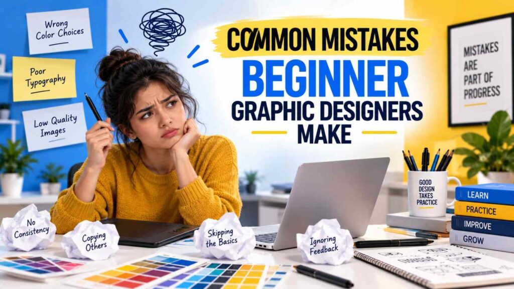
Common Mistakes Beginner Graphic Designers Make
COMMON MISTAKES BEGINNER GRAPHIC DESIGNERS MAKE are often related to design fundamentals, poor software usage, weak visual hierarchy, inconsistent layouts, lack of practice, and trying to make every design look complicated. Starting graphic design can be exciting, but beginners often focus heavily on software tools while overlooking the principles that make a design clear and effective.Graphic design combines creativity, communication, technology, and problem-solving. Learning applications such as Photoshop, Illustrator, InDesign, Figma, Canva, or CorelDRAW is useful, but software knowledge alone does not automatically produce professional designs.Understanding the COMMON MISTAKES BEGINNER GRAPHIC DESIGNERS MAKE can help new designers improve faster, develop better creative habits, and create work that communicates ideas more effectively.
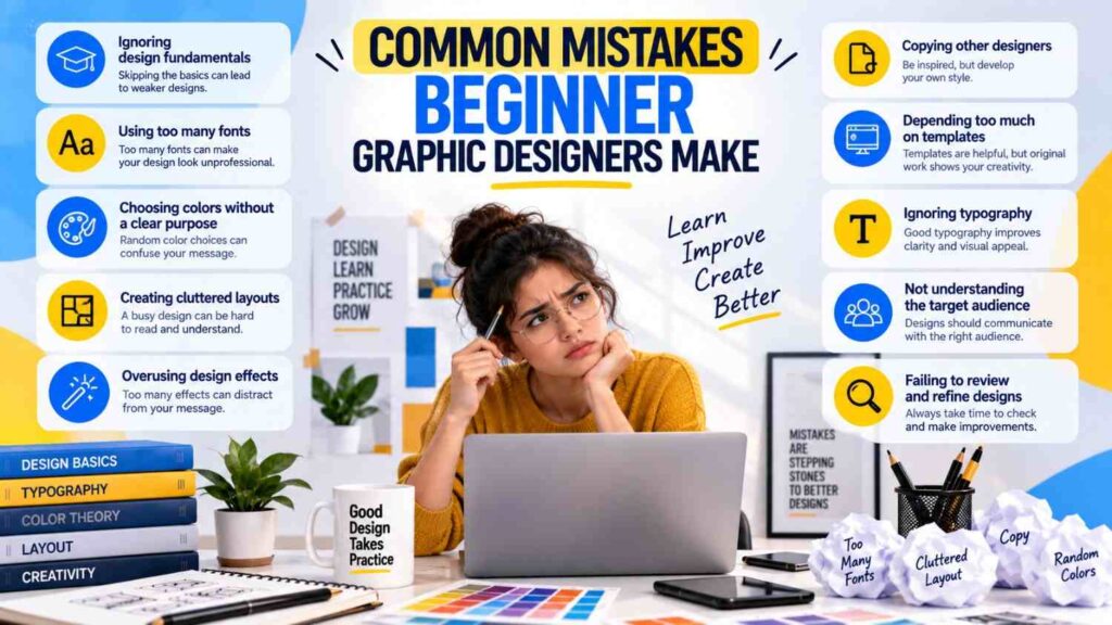
COMMON MISTAKES BEGINNER GRAPHIC DESIGNERS MAKE
Every designer starts somewhere. Making mistakes is a normal part of learning, but recognizing repeated problems can make the learning process more productive.
Some of the most frequent mistakes include:
- Ignoring design fundamentals
- Using too many fonts
- Choosing colors without a clear purpose
- Creating cluttered layouts
- Overusing design effects
- Copying other designers
- Depending too much on templates
- Ignoring typography
- Not understanding the target audience
- Failing to review and refine designs
These mistakes do not mean a beginner cannot become a successful designer. They simply show areas where more practice and understanding are needed.
1. Ignoring Basic Design Principles
One of the biggest COMMON MISTAKES BEGINNER GRAPHIC DESIGNERS MAKE is trying to create attractive designs without understanding basic design principles.Design principles provide structure and help viewers understand visual information.
Important principles include:
- Balance
- Alignment
- Contrast
- Hierarchy
- White space
- Proportion
- Repetition
- Consistency
- Color harmony
- Visual flow
These principles are also identified in the uploaded source as important concepts for producing professional-quality graphic design work.A beginner may add several elements to a poster simply because the empty space feels uncomfortable. However, white space can improve readability and help important information stand out.Instead of asking, “What else can I add?”, ask, “What can I remove?”That simple change in thinking can significantly improve a design.
2. Using Too Many Fonts
Typography is an important part of visual communication, but beginners often use too many typefaces in one project.
A poster might contain:
- One decorative font for the heading
- Another font for the subtitle
- A different font for the body
- Another font for contact information
- Several different font styles for emphasis
The result can feel inconsistent and difficult to read.A better approach is to create a clear typography hierarchy.
For example:
Heading
Use a strong typeface that attracts attention.
Subheading
Use a complementary style that supports the main heading.
Body Text
Choose a readable font for longer information.
Typography should help viewers understand the content instead of competing with it.
3. Choosing Colors Without a Purpose
Color is more than decoration.Another common beginner mistake is selecting colors simply because they look attractive individually.
A successful color combination should consider:
- Brand identity
- Audience
- Readability
- Contrast
- Mood
- Context
- Visual hierarchy
For example, a business presentation may require a different color approach from a children’s event poster.Beginners should also check whether text remains readable against the background.Using a bright color for both the background and text can reduce contrast and make important information difficult to read.
4. Making Every Design Too Complicated
Many beginners believe that a professional design should contain numerous effects, shapes, gradients, shadows, and decorative elements.This can result in visual clutter.Good design does not necessarily mean complicated design.
A simple layout can be highly effective when it has:
- Clear hierarchy
- Strong typography
- Appropriate spacing
- Consistent alignment
- Purposeful color
- Relevant imagery
Before adding another effect, ask whether it improves communication.If an element does not contribute to the message, it may not be necessary.
5. Ignoring Alignment
Poor alignment is another one of the COMMON MISTAKES BEGINNER GRAPHIC DESIGNERS MAKE.A design can contain excellent images and typography but still appear unprofessional if elements are positioned randomly.Alignment creates order.For example, headings, paragraphs, images, icons, and buttons can be aligned along consistent visual lines.Beginners should use guides, grids, rulers, and alignment tools when available.Instead of placing each element wherever it looks acceptable, establish a layout system first.This creates consistency and makes the design easier to understand.
6. Not Using Enough White Space
Beginners sometimes try to fill every available area of a canvas.This often produces crowded designs.White space refers to the empty areas surrounding design elements. It does not necessarily mean the space must literally be white.
White space can:
- Improve readability
- Separate sections
- Create visual balance
- Highlight important information
- Make a layout feel cleaner
- Improve visual hierarchy
Leaving space around a heading can make it more noticeable.Similarly, increasing the space between paragraphs can improve readability.Empty space is therefore an active part of design rather than wasted space.
7. Overusing Effects and Filters
Photoshop and other design applications provide many effects and filters.
Beginners may be tempted to use:
- Drop shadows
- Glows
- Bevels
- Heavy gradients
- Text effects
- Blurs
- Outlines
- Distortions
These tools can be useful when applied carefully.The problem occurs when effects become the main feature of the design.A strong designer uses effects to support an idea rather than relying on effects to create the idea.Before applying an effect, consider whether it improves clarity, emphasis, or visual consistency.
8. Depending Too Much on Templates
Templates can be helpful for learning layouts and understanding how professional designs are structured.However, relying completely on templates can limit creative development.One of the COMMON MISTAKES BEGINNER GRAPHIC DESIGNERS MAKE is changing only the text and images in an existing template without understanding why the original layout works.Instead, use templates as learning references.
Study:
- Spacing
- Typography
- Grid structure
- Color combinations
- Image placement
- Hierarchy
Then create your own layouts.The goal should be to develop the ability to solve a design problem independently.
9. Copying Other Designers
Inspiration is an important part of creative development.Beginners should study professional designs, but directly copying another designer’s work does not develop independent design thinking.Instead of copying a design exactly, analyze it.
Ask:
- Why does the layout work?
- How is the hierarchy created?
- Why were these colors selected?
- How is typography being used?
- Where is the viewer’s attention directed?
- How does the spacing affect the composition?
Then apply those principles to your own project.Learning from references is valuable when it helps you understand design decisions rather than simply reproduce someone else’s work.
10. Ignoring the Target Audience
A design should communicate with someone.Another important mistake is creating a design based entirely on personal preferences without considering the intended audience.
Before starting a project, identify:
- Who will see it?
- What do they need to understand?
- What action should they take?
- What visual style is appropriate?
- Where will the design be displayed?
A corporate presentation, social media advertisement, educational poster, restaurant menu, and children’s event graphic may all require different approaches.Good graphic design connects visual decisions with communication goals.
How to Avoid Common Graphic Design Mistakes
Avoiding COMMON MISTAKES BEGINNER GRAPHIC DESIGNERS MAKE requires a combination of knowledge and practice.
Use this simple checklist before completing a project:
Design
- Is the message clear?
- Is the hierarchy obvious?
- Are elements aligned?
- Is there enough white space?
- Are colors appropriate?
Typography
- Are the fonts readable?
- Is the hierarchy clear?
- Is the spacing comfortable?
Images
- Are images high quality?
- Are they relevant?
- Are they cropped properly?
Content
- Has everything been proofread?
- Is the information accurate?
- Is unnecessary text removed?
Technical
- Is the correct file format being used?
- Is the artwork exported at an appropriate size?
- Are the working files organized?
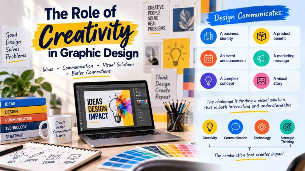
The Role of Creativity in Graphic Design
Creativity is important, but creativity does not mean making something visually unusual every time.Creative thinking involves finding appropriate solutions to communication problems.
A designer may need to communicate:
- A business identity
- A product benefit
- An event announcement
- A marketing message
- A complex concept
- A visual story
The challenge is finding a visual solution that is both interesting and understandable.The source material similarly describes graphic design as a combination of creativity, communication, technology, and strategic thinking.
Common Mistakes Beginner Graphic Designers Make When Building a Career
Some mistakes happen beyond individual design projects.
Beginners may also:
- Build a portfolio without a clear direction
- Apply for every type of design role
- Ignore communication skills
- Stop learning after mastering one application
- Avoid networking
- Fail to update their work
- Underestimate presentation quality
- Focus only on software certificates
A design career requires continuous development.Graphic design opportunities can include roles such as graphic designer, UI designer, brand designer, packaging designer, visual designer, motion graphics designer, social media designer, advertising designer, and creative executive.Choosing a direction can help you develop relevant skills and projects.
Conclusion
Understanding the COMMON MISTAKES BEGINNER GRAPHIC DESIGNERS MAKE can make the learning process more focused and productive. Beginners often struggle with typography, alignment, color selection, white space, visual hierarchy, software usage, and consistency. These challenges are normal parts of developing design skills.The key is to avoid repeating the same problems without learning from them. Study design fundamentals, practice regularly, create meaningful projects, seek constructive feedback, and review every design before considering it complete.Graphic design is a continuous learning process. As your technical knowledge and creative thinking improve, you can gradually develop stronger projects, build a more professional portfolio, and explore different career opportunities. By recognizing and correcting the COMMON MISTAKES BEGINNER GRAPHIC DESIGNERS MAKE, new designers can build better habits and become more confident visual communicators. Improve your understanding of graphic design fundamentals and visual communication by exploring the Nielsen Norman Group’s design resources .